The most famous logos in the world and what we can learn from them
The most recognizable logos in the world belong to well-known brands and organizations. They may not be distinguished by complex designs, but what they can boast of is recognition and influence.
Whether these logos have been around since the brand's inception, have changed over time, or are completely different from what they originally were, we'll take a look at the world's most famous logos to gain more knowledge about successful logo design.
So, let's get started
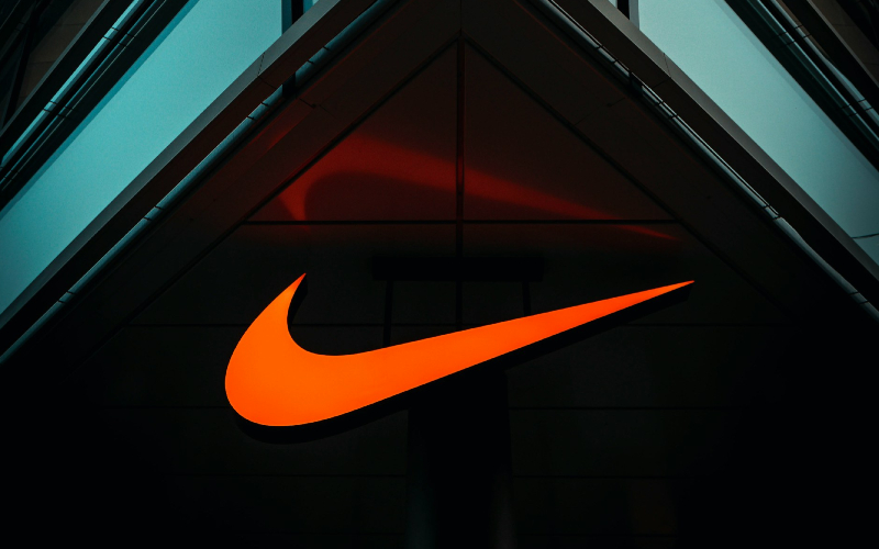
1. Nike
The "swoosh" sound, an iconic logo created by Carolyn Davidson.
The "swoosh" logo mimics the wings of Nike, the goddess of victory in Greek mythology. It also signifies achievement, or in other words, "just do it." The fluid silhouette of the logo, which embodies movement and speed, shows how much effort has been put into the brand's values in an abstract, minimal design.
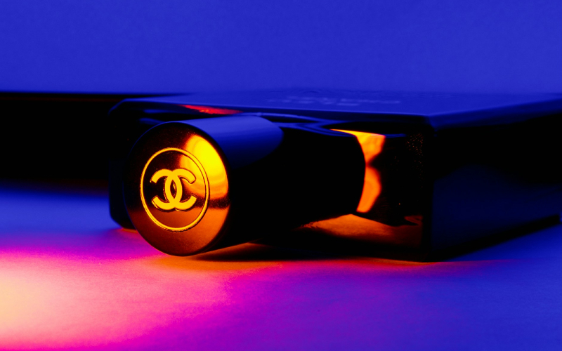
2. Chanel
"Chanel" is a fashion standard that is associated with luxury, elegance and the Parisian identity of the creator. Therefore, the logo that we know today is the initials of its creator's name.
Color scheme - black and white. The logo stands out minimalistically in a large space. It does not contain any additional effects. Everything is very neat and perfectly symmetrical.
Exactly what a fashion house should have, known for its original "little black dress". It is precisely its simplicity that makes it effective and powerful. It is precisely thanks to this simplicity that the Chanel logo is so effective.
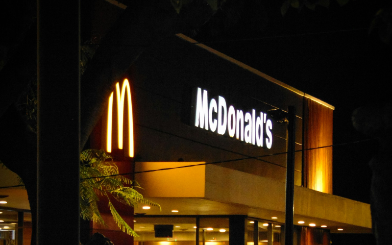
3. McDonald's
The McDonald's logo, also known as the "Golden Arches," was inspired by the real golden arches that were part of the fast food chain's original design. The logo design combines the two arches that have adorned the restaurant chain to this day, transforming it into a letter M logo.
The golden arches set against their signature red background evoke the aesthetic of the "drive-in" restaurant chain of the 1950s. It's a logo that McDonald's uses everywhere and in everything - on packaging, uniforms, buildings, advertisements, and all other types of communication related to McDonald's.
We can learn from McDonald's how important it is to be consistent and adhere to the golden style in all aspects.

4. Tesla
A company that has undoubtedly had a huge impact on one of the largest industries. The T in the logo represents the first letter of the company’s name, and includes an armored shield, which makes the logo modern and emphasizes the high level of the brand, security and durability. Every detail of the logo represents style, elegance and innovation.
The letter “T” is designed in such a way as to create a feeling of upward movement through electricity, movement towards the future. Such small details can add great meaning to static logos.
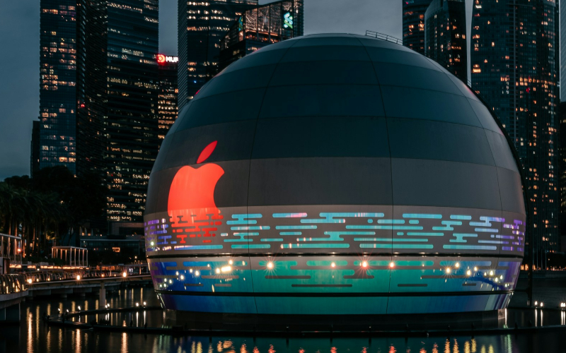
5. Apple
The Apple logo is one of the most recognizable trademarks. The logo was created by Rob Jenoff in Steve Jobs and Steve Wozniak's garage in 1977.
Why Apple chose an apple as its logo and why it has a bite on it has given rise to many legends, from the cyanide-laced apple that Alan Turing bit into to the visual reference to the word "byte".
Rob explained that the design of the Apple logo was not based on Steve Jobs, but on the spirit that would bring computers closer to people.
The designer emphasized the importance of the idea, noting that the method here is secondary, that the modern digital world has become so technological that people have forgotten the most important thing. That is why this logo combines centuries-old earthly wisdom with everything that is modern, constantly changing, and fleeting.
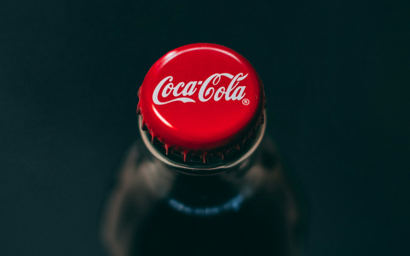
6. Coca-Cola
The Coca-Cola logo is known for its versatility and appeal, but it has come a long way since its current incarnation. Its logo is more than just a design. From conveying the brand’s mission, vision, and values to highlighting the company’s products and services, the logo helps to reinforce the brand’s identity. One of the most interesting aspects of the Coca-Cola logo is that it represents what the company sells.
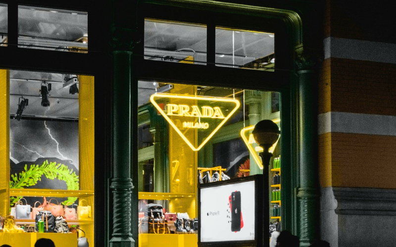
7. Prada
The luxury fashion house Prada is so careful about its logo that it has never changed it. This is typical of brands whose emblems carry the meaning of tradition and heritage.
In 1919, 6 years after Prada was founded, the fashion house officially took care of the clothing of the Italian royal family. It is for this reason that the monarchs gave Mario Prada the right to use the historical coat of arms as a detail of the brand symbol.
The Prada sign combines an angular and simple shape, which contains the word, coat of arms and ribbon. It is both modern and traditional at the same time.
In 1978, after Mucha Prada took over the brand, he engraved the logo on a triangular metal plate and used it as a detail on bags. Since then, the updated logo has been considered Prada's calling card.
Many people have ideas, but only Lemons.ge has solutions!
Lemons.ge team is always by your side when you need creative vision and real results.
Address: 117a Tsereteli Ave.
Contact: ( 995) 032 2 45 01 01

Other News


