Creating a logo - what are the stages before making a logo?
A logo is one of the most important elements of a corporate identity. It reflects the image of a company, distinguishes it from competitors, and promotes brand awareness. Most people remember a company's logo first. This means that creating an effective logo is a key business task.
When creating a logo, the first thing you need to do is choose a type. Let's take a look at each of them.
According to traditional classification, logos are divided into 3 groups:
- Font only (text);
- Graphics;
- Font + Graphics (combined).
But some time ago, an American journalist and editor at 99designs divided logos into 7 types:
Font only
A text logo is a brand image expressed in letters. It has no graphic component. Depending on the scale of the business and the tasks set, the font can be created from scratch or selected from an existing one. In the latter case, it is better not to use very common fonts.
In turn, the font logo is divided into two types:
- Abbreviation (a word that is a contraction of two or more words);
- Monogram (a sign made up of two or more letters).
Many companies have long names that consist of several words. Their main disadvantage is the difficulty of remembering. In addition, using a name consisting of 3-4 words in a logo is quite a difficult task. Such a logo may look beautiful on a billboard, but it will not be so easy to distinguish it on a business card.
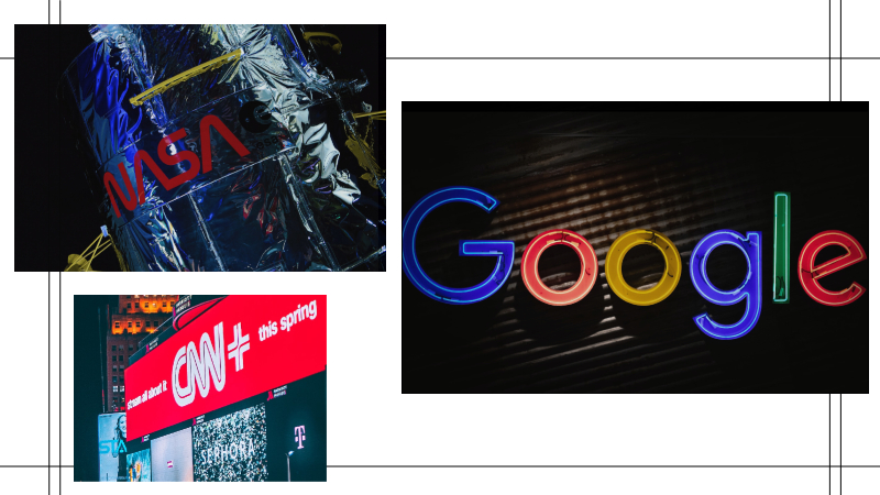
It is in such cases that companies use abbreviations of their names. This technique helps to improve the aesthetic side of the logo and also makes the name easier to remember. NASA, IBM, P&G, HP and many other brands use abbreviations of their names in their logos, because abbreviations are a popular way to shorten long names all over the world.
Words
Such logos are effective in cases where the company has a clear, easy-to-pronounce name, consisting of one not too long word.
By combining different fonts and colors, you can use the logo to emphasize certain features of the brand. Examples of this type of logo are: BRAUN, MANGO, VISA, Google, etc.
Graphic logos
Essentially, these are graphic images that differ in style and, most importantly, in story. Based on the latter, all types of graphic logos are divided into three groups.
1. Photo-visual logos
The design of such logos is graphics in its purest form. However, it is impossible to call this type of logo just a picture. Despite its apparent simplicity, it has a deep meaning, reflects the main idea and character of the brand, attracts the target audience and evokes the right emotions in them.
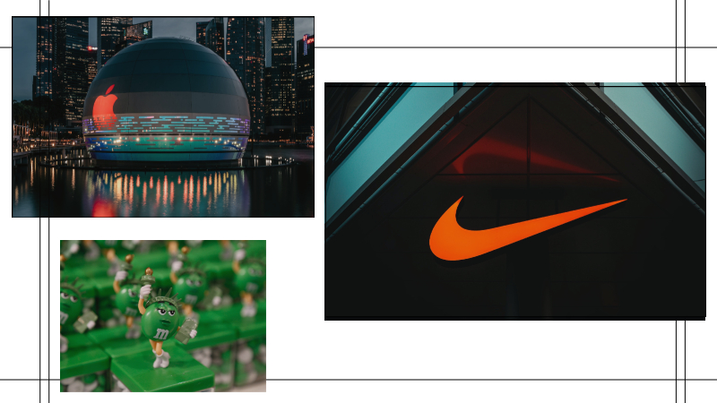
The advantage of graphic logos is their ease of memorization and recognition. Logos of this type include: Apple, World Wildlife Fund, The Rolling Stones, Playboy and others.
2. Abstraction
This type of logo is not based on any symbol (apple, bird, panda), but on an abstract image. The most famous brands that have chosen this type of logo are: Pepsi with its tricolor circle and Nike with its Swoosh, which has remained almost unchanged since 1971.
The undoubted advantage of abstract images is the ability to create a unique visual image. By using shape and color wisely, you can incorporate both the character of the brand and positioning and other components of ideology into the logo.
3.Mascots (brand mascot)
A drawn person, animal or fairy-tale character provides effective communication with the target audience, creates the right mood and evokes positive emotions. As a rule, such logos are used by companies whose target audience is families with children. But in other groups you can occasionally see logos with a similar symbol. Remember the MICHELIN tire man or the M&M chocolate characters, KFS.
Combined logos
Text and graphic logos
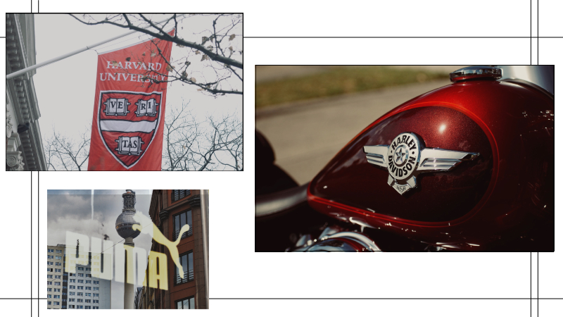
What are they like? Image + letters + abbreviation + word. Many brands use such a logo: Lacoste, Microsoft, Puma and others.
The advantage of text-graphic logos is that these two elements are closely related to each other, which gives them a unique and easily memorable look. The image attracts attention, and the text provides information about the company. Thanks to this, the logo immediately begins to be associated with the brand.
Emblem
Unlike the text-graphic logos discussed above, the emblem is built on the principle of a coat of arms, according to which the inscription is placed on the inside of the image. These logos are quite universal. They are used by companies such as: Harley-Davidson, Warner Bros, Harvard, NFL, Alfa Romeo, Porsche and other famous brands.
Many people have ideas, but only Lemons.ge has solutions!
Lemons.ge team is always by your side when you need creative vision and real results.
Address: 117a Tsereteli Ave.
Contact: ( 995) 032 2 45 01 01

Other News


