Creating a logo - a design that attracts attention
A logo is a necessary and important factor for effective branding and market dominance.
The logo design process is not an easy one. It is an undertaking that requires time, thought, creativity, and teamwork to create a logo that your audience will never forget.
A logo is a branded design that functions as a symbol for a particular business and represents the essence of its purpose and personality. A logo is a unique graphic mark of a company, or rather, a brand.
Just like the ubiquitous Nike swoosh or McDonald’s golden arches, your logo will become the face of your brand, acting as an identifying factor that your audience will recognize over time and ultimately associate with trust in your services, content, or products.
If you are a startup company and want to create a logo design, you can use Wix Logo Maker and customize the design details in a simplified manner.
Whether you create your logo in a logo maker app or have a graphic designer draw it for you, it is essential to follow the following processes:
1. Define your brand identity and goals - As important as your logo is to your business, it is not a mirror of your company. A brand, in addition to the logo, consists of many components: a name, a slogan, a website, marketing materials. All of these elements have one common goal: they create a complete brand identity to successfully represent and understand the business.
You could say that your brand identity is the soul of your business and it should be reflected in both visual and written elements. It's important to think about how your brand values can be represented in your logo.
2. Look for inspiration - browse through different logo designs online. Pay attention to the best, most famous logos that you see every day. Be sure to look for relevant logo trends and interesting logo ideas. Competitor research is important for coming up with new ideas and analyzing the industry.
3. Define the logo style - There are different aesthetic styles that can define the style of a logo. Choosing one is not a matter of intuition, it should be based on your brand identity.
- Is the brand classic? - Then the logo design should be created with refined fonts and a basic color scheme.
- Is it minimalist? - In this case, choose a modern design.
- Is it modern? - Go for an abstract design.
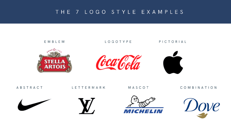
4. Choose a logo type - There are different types of logos. First, think about which one fits your brand identity and audience. Let's take a look at each of them:
- A wordmark - consists of only letters, displayed in a specific font. Most often contains the brand name.
- Logo symbol - uses a single icon to represent the brand (without text). A well-executed brand has the potential to go viral.
- Abstract logo - uses geometric shapes to create an image that is truly unique. This type is important because its meaning is easy to understand even for foreign companies.
- Emblems - a classic style designed for badges and seals. Although it is a traditional style, it has been successfully modernized and used in branding since the 20th century.
- Combination - as the name suggests, this type of logo includes both text and images. It can be: a letter with a mascot, a word mark with a logo symbol, or an abstract design. This is the most effective option to start with, as the image and text will work together to strengthen your brand.
- Dynamic - An adaptable and flexible logo style that can change its color, shape, and text depending on the context. Dynamic logos are always changing. For example: Google's logo is constantly changing to reflect current events. Also, MTV's logo, which highlights pop culture, cultural changes and trends, and embodies its brand values.
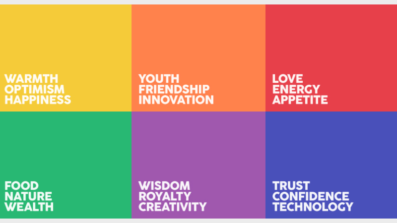
5. Decide on a color scheme - Colors have a lot of power over consumers. Color psychology tells us that different colors and tones can evoke emotions in an audience, which can influence their behavior. Choosing a logo color scheme for your design serves two purposes:
1. To elicit the desired reaction from your customers;
2. To reinforce your brand awareness.
Web colors are digital representations of different colors used to create websites and other digital design projects. These colors can be used to convey a variety of messages, from energy and enthusiasm to sophistication and reliability. Web colors are usually defined as one of 16 million shades, including red, orange, yellow, green, blue, purple, and pink.
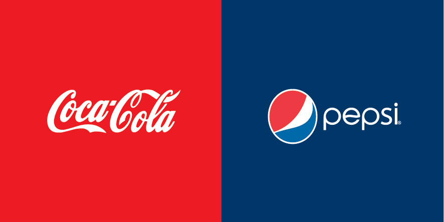
And when it comes to logo color options, we can divide them into three categories: black and white logos, monochrome logos, or color combination logos. A black and white theme can suit your logo if you’re going for a sleek minimalist style or a classic design. Monochrome logos (logos that feature a single color) work well with wordmarks and letters and can make a strong impact by further associating an individual color with your brand. A successful example of this is Coca-Cola or Tiffany's Robin Egg Blue, as red is associated with these two brands.
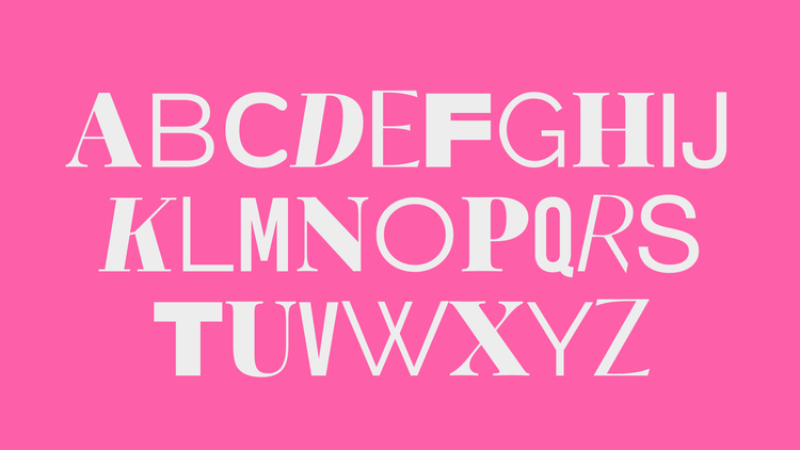
6. Choose a font – Like your color choice, your typography choice should enhance the recognition and visibility of your logo. While there are an infinite number of fonts out there, you can start by eliminating a few basic font families: serif, sans-serif, or highly stylized fonts.
When designing a logo, it’s best to choose web-safe fonts. Web-safe fonts are those that are widely available across all operating systems and devices, making them an ideal choice for designers who want to ensure that their finished product looks consistent across platforms. While there’s no definitive list of web-safe fonts, a few popular choices include Arial, Verdana, Georgia, Times New Roman, and Courier New.
Your font can be used in a variety of ways in your logo design. A minimalist design might call for a simple serif or sans serif font – clean, readable, and simple. When working with a combination logo, a simple and readable font may be just as important, but you should also consider the alignment and balance of the image with your text.
By emphasizing the font, designers can draw attention to specific words and make them stand out from the rest of the text.

7. Outline the shape of your logo - When designing your logo, think about what shapes you will incorporate into your design. Shapes play a big role in perception and instant logo recognition.
Understanding the psychology of logos and their emotional impact will allow you to create a purposeful logo that authentically conveys your brand message.
All forms can be divided into three categories:
Geometric shapes - All are made up of unique configurations of lines, points, and curves and are most often symmetrical. These include circles, triangles, rectangles, squares, and lines.
Organic shapes, also known as freeform shapes - refer to any natural shape. These shapes are most often irregular and asymmetrical. Organic shapes include leaves, flowers, water droplets, or other shapes found in nature. They also include spirals, rounded edges, and curved shapes.
Abstract shapes - Do not follow any rules and can take on many different forms. Sometimes created by combining other existing elements or creating something completely new, abstract shapes are great for telling a story or evoking emotion. Abstract logos can be thought-provoking and attractive.
8. Refine Results - This is the stage where you review the logo from start to finish and once again define what you want it to achieve. Don’t forget to review your logo in all the different file formats it will ultimately be displayed in. File formats will determine how the final image will be presented online and in print.
9. Make a final decision - You can share the results with your audience in the form of a survey and make a decision. Not only is this a great way to see how the public reacts, it’s a smart marketing tactic that will definitely build brand awareness around your new visual identity. It’s important to gather a few different opinions.
10. Get your logo out there and make people remember you - Start by downloading high-quality image files of your logo. PNG and JPG files will work well on your website and social media platforms. A vector file (SVG or PDF) will allow for greater scalability - ensuring your logo will look good on any size and printed material.
Apply it to all of your brand’s marketing assets. This includes your website, business cards, packaging, posters, and anything else you want to brand. If your logo is too complex for some locations, you can create a simpler variable logo to go with it.
“A truly successful logo goes beyond just an image. It tells a story that deeply connects with its audience. Creating such a logo involves combining elements that reflect the brand’s identity, appeal to its target audience, and incorporate current design trends.”
Many people have ideas, but only Lemons.ge has solutions!
Lemons.ge team is always by your side when you need creative vision and real results.
Address: 117a Tsereteli Ave.
Contact: ( 995) 032 2 45 01 01

Other News


