White space in web design: what is it and how to use it?
White space is not a void. It is actually one of the most powerful, creative elements in web design.
If you're curious about what white space is and how it can play a role in your website design, keep reading. In this article, we'll define the design term and the benefits of using it when creating a website.
What is white space?
White space gained popularity in the first half of the 20th century. Since then, web designers have recognized its importance and versatility, regularly incorporating white space into their work.
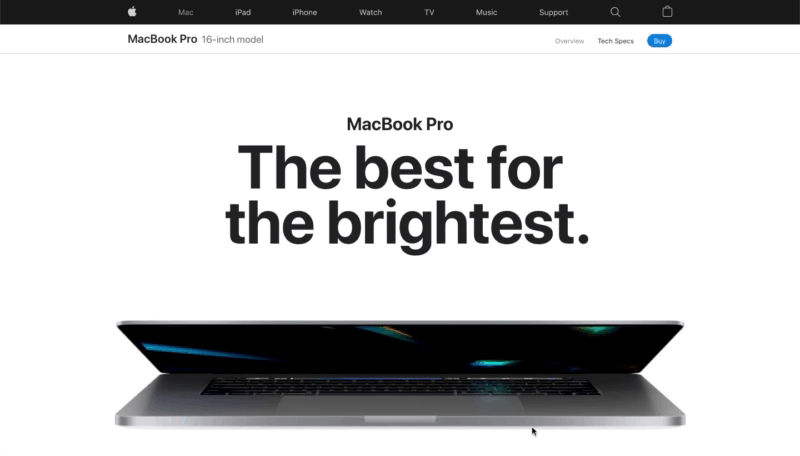
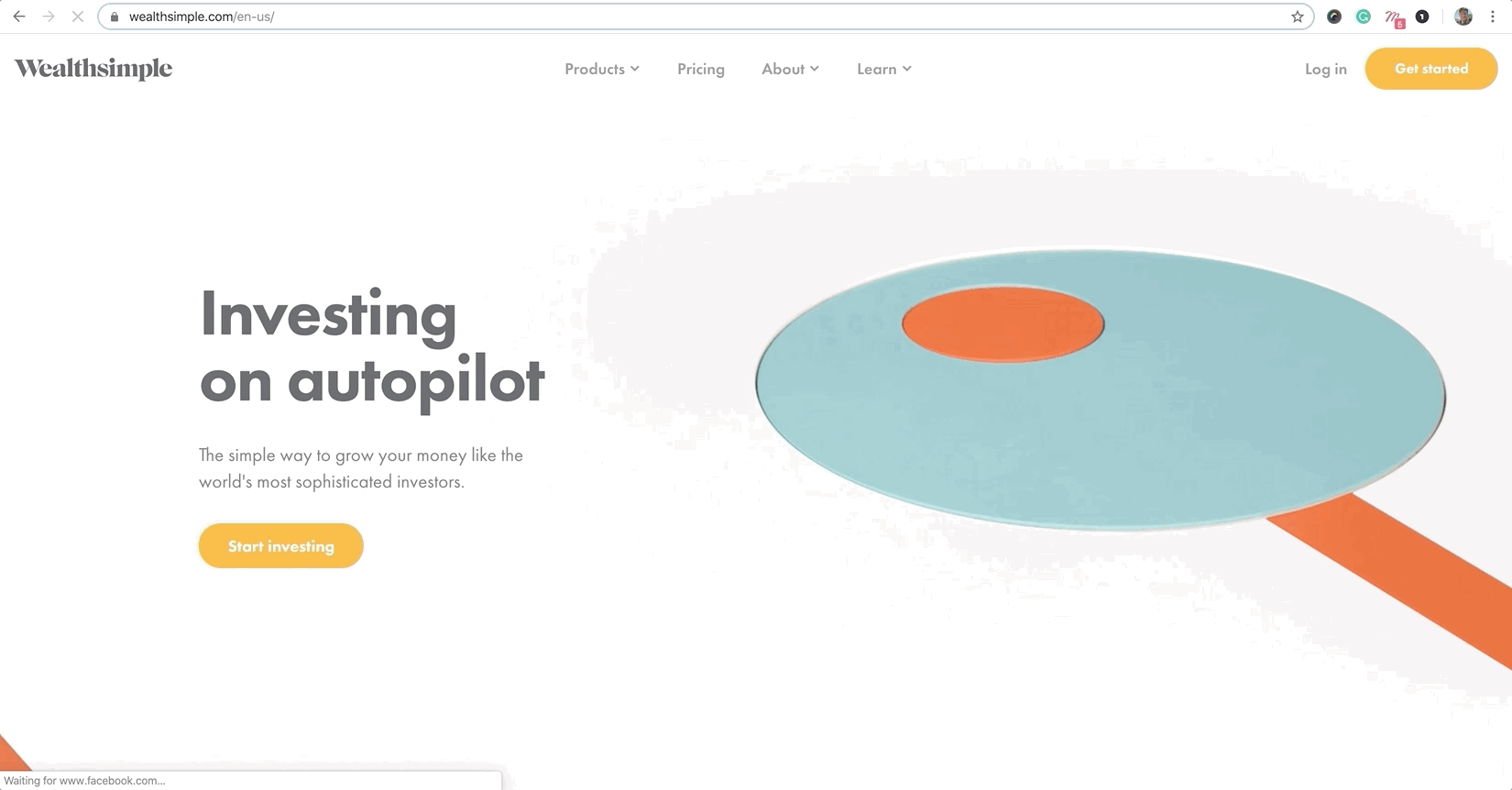
White space can balance a visual space, direct visitors’ eyes to certain areas, and even improve the user experience.

What are the benefits of using white space in web design?
Although white space may be “invisible” to the viewer, it plays an important role in the user experience, benefiting both website visitors and the brand behind it:
- Enhances readability - With enough white space between letters, words, and lines, visitors can quickly read and understand content;
- Creates harmony - When the web is crowded, a well-balanced and minimally designed website with white space can help visitors feel safe, comfortable, and oriented;
- Enhances brand tone - As a modern element of website design - white space can communicate a brand's personality and style;
- Helps organize - Helps maintain visual hierarchy. Negative space can help create an organized context, which improves the usability of your site;
- Encourages visitors to take action - White space can highlight critical calls to action that guide visitors to schedule an appointment, purchase a product, or contact the company for more information.
White space practices in web design
1. Use both micro and macro white space
Each serves a different purpose on your site.
Micro white space refers to the spaces around small elements on a web page, such as text. Implement micro white space to increase readability, as even the smallest change can hinder or improve readability.
Macro refers to larger spaces in web design, such as between different sections on a page or between images in a photo gallery. Implement macro white space on your site to improve the user experience by increasing visibility and organizing your content.
2. Ask questions
As mentioned above, white space can enhance your website design, but deciding how much to use can be tricky. Every use of white space serves a purpose, and to help you determine this, ask yourself these questions:
- Does this space look too empty?
- Can visitors easily read the text?
- Can they easily grasp the important points?
- Does the white space detract from or enhance surrounding elements?
- What is the ideal amount of white space?
3. Manage visual hierarchy with white space
When websites are cluttered with layouts, visitors have a hard time knowing what details to focus on or where to go next, becoming confused and unable to give themselves free rein.
White space highlights the most important parts of a page, cleans up the visual hierarchy for visitors, and increases their trust and satisfaction with your brand experience.
The example below contains four service blocks that can be stacked and arranged in different ways. The right combination of white space clarifies the visual hierarchy, making it easier for visitors to read the description of each service, which will be beneficial for the company.
4. Pay close attention to buttons
The most effective websites have a primary call-to-action button: For a restaurant website, it might be “Make a reservation.” For e-commerce businesses, it’s “Buy now.” For a blog, it’s “Subscribe.”
Leave enough white space around your website buttons. This doesn’t mean you have to make your text or buttons stand out, but add enough white space so that visitors can easily find and click on them without distraction.
5. Don’t forget about mobile phones
With less space on smaller screens, white space has a big impact on mobile websites.
For example, take this sample about page below. The large “About Me” headline has two paragraphs below it. On desktop, this looks great because of the wide margins on the page. However, when you switch to mobile, you’ll notice how the margins are squeezed.
The solution? When designing a website, it's essential to test what and how it will look on mobile phones. Increase your font size or add paragraphs. Then conduct research to test white space on different devices to improve the look of your website.
Many have edges, but only Lemons.ge has solutions!
Lemons.ge team is always by your side when you need creative vision and real results.
Address: 117a Tsereteli Ave.
Contact: ( 995) 032 2 45 01 01

Other News


