10 creative branding trends in 2019, Part 2
27. 03. 2019
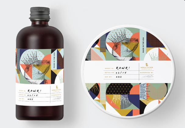
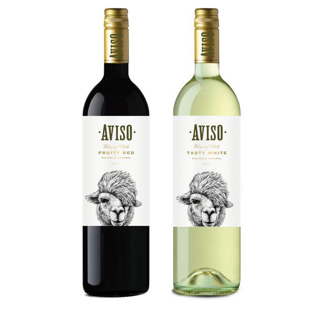
5. Intricate design
The purpose of this typographic trend is to break down the complex decorative details and ornaments in the design
Drawing inspiration from baroque and art deco design styles, also popularity of hand-drawn illustration is what minimalists aim to strip away.
So, this particular trend includes the following:
- Line shading
- Repeated patterns of ornament, interlocking shapes
- Refined details (eyelashes, wrinkles, individual features and etc.)
- Concentric and parallel lines
- Visual flourishes to fill negative space
Even though such trends are aesthetic and beautiful, shapeshifting logos should not be forgotten. Detailed visuals can be a big boost at times while sometimes you need something simpler. So balance is also very important.
Mad pepper
Justswell- Logo
merci dsgn- Logo
Jani Tavanxhi -Logo
thedani- Logo
6. Pixel art
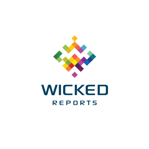
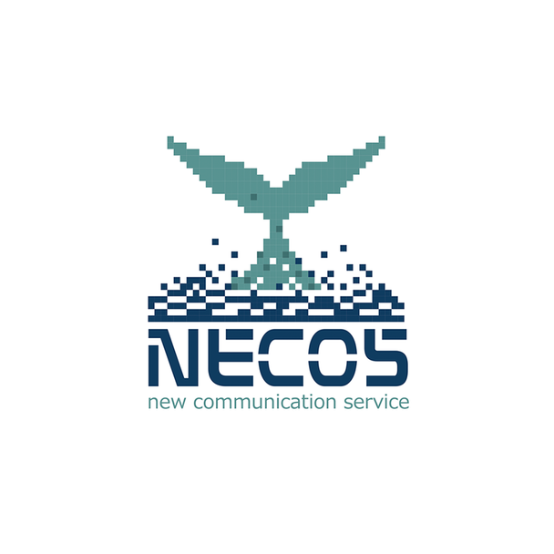
In case you want to add both futuristic and retro to your style try pixel art. It combines nostalgia for the 80s-90s video games with the forward-thinking style of digital art. Pixel (8 bit) art uses big monochronic squares that resemble pixels and their unity creates different shapes.
This trend allows you to create any visuals from the 80s or just choose something more abstract and post-modern pixel figure.
aarif™ -Logo
Milusko -Logo
CostinLogopus - Logo
undrthespellofmars- Logo
7. Ghost letters
While trends of topography tend to follow its rules, ghost letters have been developing. The trend involves outlines of letters with transparent insides, allowing one to see through them at the background image.
The first step in this trend is the ghost button which became popular alongside the hero image trend of the early 2010s. Transparent buttons are designed to avoid unnecessary attention and do not overlay the image effect.
This combines 2 trends, you get ghost letters – big typography, that is more subtle and doesn’t take visitors attention away from background images. Choose big letters, put bold outlines so that customers can read well and remember, such a style can only be used in headings.
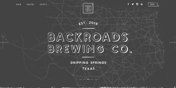
simplest™ - Logo
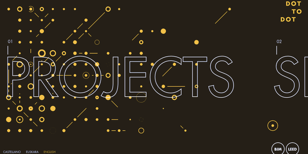
Cuchillo Logo
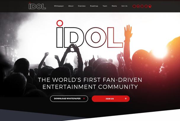
Mithum - Logo
goopanic - Logo
For my consultation and help, me and my company will be always with you.
Only original solutions - Lemons.ge
Address: Tsereteli ave. #117ა
Office: (+995) 032 2 45 01 01

