The Principles of Design
The principles of design are universal ideas used by designers to create an effective composition in site designing, logos, posters, and etc. The most important, fundamental principles of design include balance, contrast, dominance, hierarchy, proportions, and unity of the style.
Balance
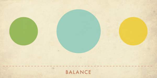
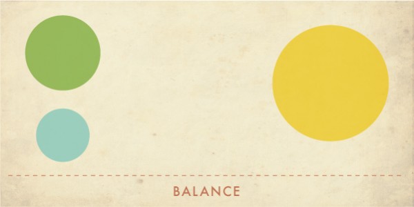
Each element has its weight. Balance guarantees the weight of a figure in your composition. It can be achieved by the following methods:
- Symmetric (formal) balance - figures aligned equally on a horizontal or vertical line. It can also be radial symmetric on a central axis.
- Asymmetric (non-formal) balance - It creates a composition that is not even. Figures are not equally aligned and usually, the accent is on the one side or on an element.
Contrast
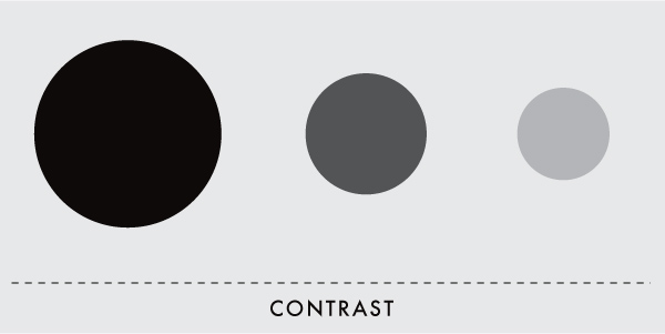
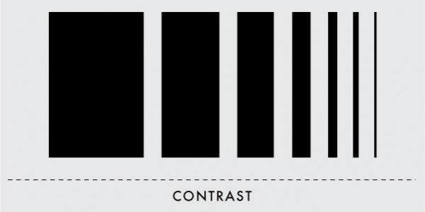
It is an interaction of controversial elements such as color, form, size, texture, space, and etc. An example of it is big and small, brutal and smooth, thick and thin, black and white. Contrast creates a difference between elements in a design.
Negative space, the same as empty space, is an important component of contrast. It helps you to show significant details of your composition. Therefore, it makes your design exclusive and minimalistic.
Dominance
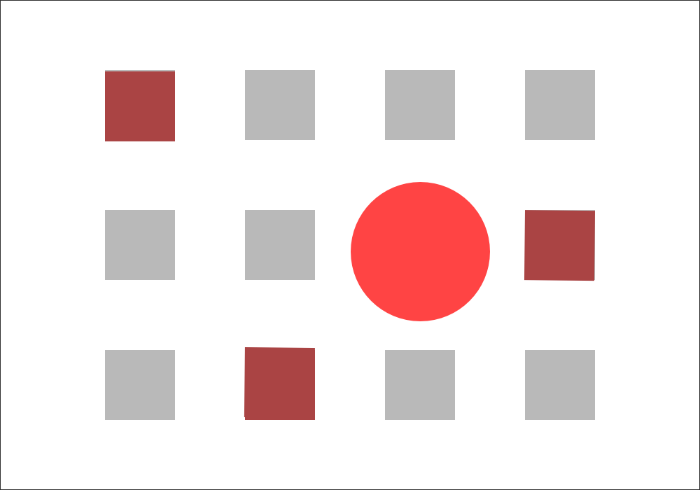
The principle of dominance is focusing on one or more than one element. Usually, they use different forms, fonts, and colors (Contrastive colors). Dominance may have three levels.
- Dominant - it consists of a single element in the foreground and have the most visual weight.
- Sub-dominant - Secondary element of composition placed in the center.
- Subordinate - it recedes into the background to some degree and has the least visual weight.
Interesting fact! The visual center is the point on which a person is focused while observing the design. It is usually located on the upper or the right side of an actual center.
Movement

Movement is the path a viewer’s eye takes while looking at composition. You can make your design attractive, interesting and thoughtful with the help of such elements as lines, colors, and shapes.
Proportion or scale
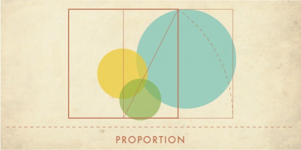
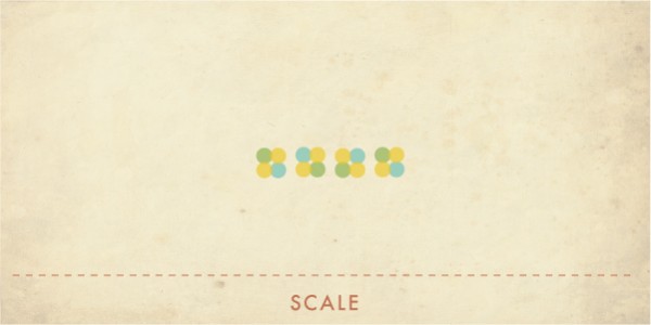
Proportion is responsible for visual weight and size of elements and their interaction with each other. This principle is also called a scale.
Using elements of different sizes creates a focusing point. It also highlights the importance of each element on the composition.
Unity
Visual unity, as considered, is the main goal of designing. However many professionals oppose this idea. Unity and harmony mean the sequence of individual elements in general.
Unity has several principles:
- Straightening - When an object is located on a particular axis or plane;
- Expanding - When the line is expanding;
- Perspective - When objects are far from each other;
- Proximity - when objects are aligned near to each other;
- Repetition - when details are used more than a few times;
- Rhythm - repeating objects with small changes.
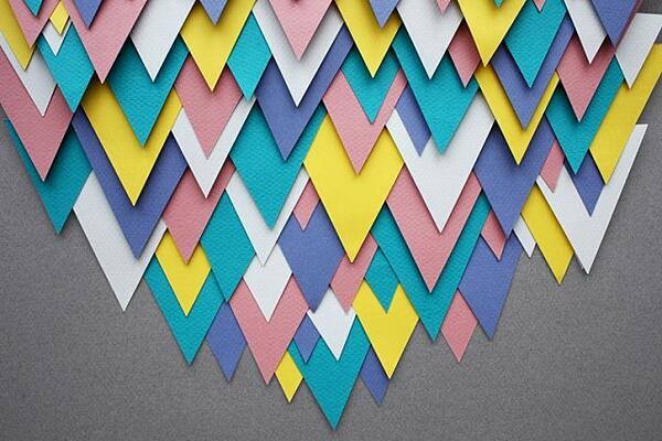
Even though design principles are universal, according to the different techniques, it is interpreted in various ways.
For my consultation and help, me and my company will be always with you.
Only original solutions - Lemons.ge
Address: Tsereteli ave. #117ა
Office: (+995) 032 2 45 01 01


