1. Shapeshifting logos
Let’s start with the most important change which 2019 is going to bring. With the help of technological progress, many marketers refuse to have an already old fashioned principle of never changing your logo. Today choices are made in favor of optimization and changing shapes of logos.
The idea is that the brands should have several versions of the logo in order to use them on different occasions. Logo for mobile application - a small, simple version. Advertising, stinging t-shirts - a black and white logo which will save you money.
If this concept is acceptable for you, we will show 3 areas where it will succeed:
Responsive: on the digital platform, where your logo will change according to the size of the screen (Personal computer, laptop, planchet, mobile phones)
Contextual: Logo changes according to where it is used. (Different logos for business cards, t-shirts and etc.)
Varying - some parts of your logo can be changed according to marketing campaign (for example, Google changes its logo on different celebration days)
There is no need for many versions - usually, four versions are enough.
Agi Amri- Different designs of one logo
goopanic- Different designs of one logo
Martis Lupus- Different designs of one logo
2. Eye-catching Serif
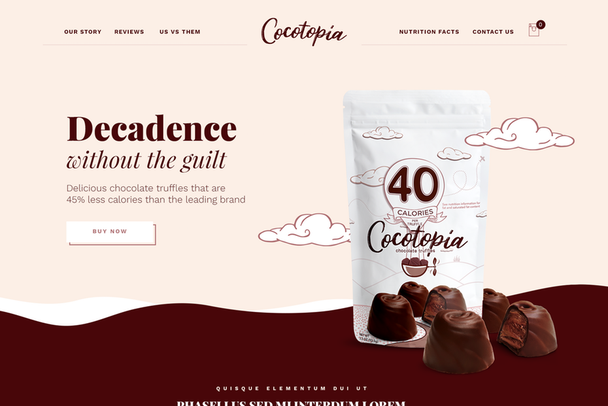
Minimalism in digital design is dominant. It is not only aesthetic but also practical. Minimalist design is loaded faster and looks good on different sizes of screen. But, lately, we see backlash to minimalism, including Serif trends.
Serif was used as a minimalist branding method. 2019 brought back this method and this can be explained by the popularity of vintage. Thus, the main reason can be its ability to give individuality to the brand. This year Serif has an individual character with a modern and classical style.
Mike Barnes
Mike Barnes
Sandra Eftimie
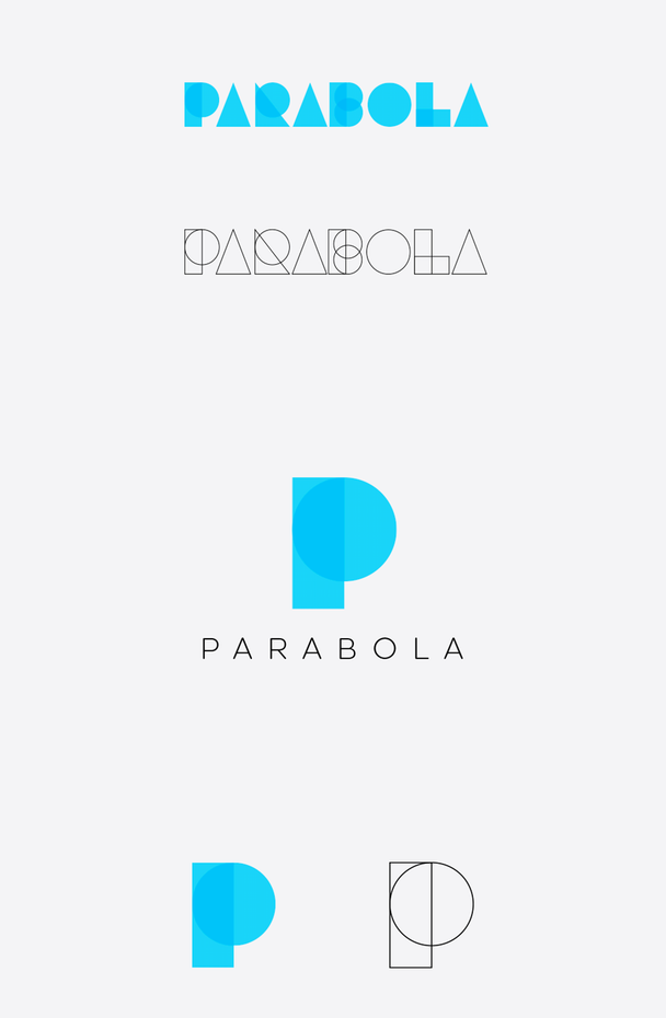
3. Friendlier Geometrics
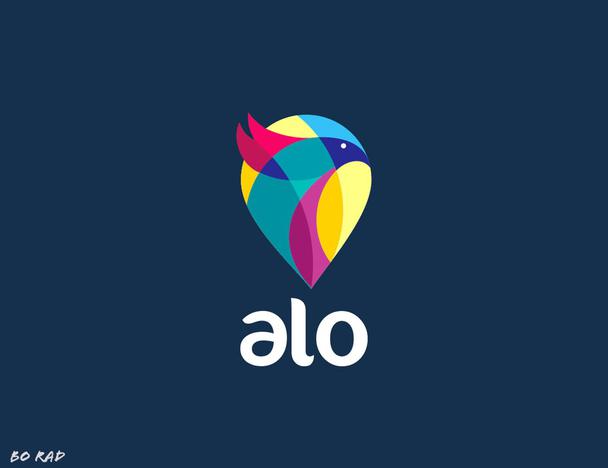
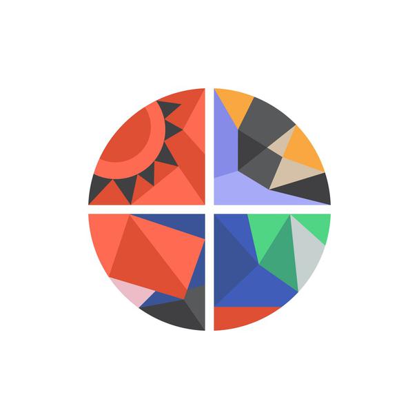
Let’s talk about one of the most futuristic trends in branding - Geometrics. It involves straight lines, grids, and abstract shapes. This style appeals to one’s desire for order. But, geometry comes with one drawback. Such mathematical designs are cold, intimidating and can also be oppressive. The solution is an evolution of geometry in branding.
To counteract such drawbacks, designers use several tricks. Firstly, you can use bright and warm colors to add some new and original look. Secondly, you can add more curves and slightly round details. It will bring more positive vibes.

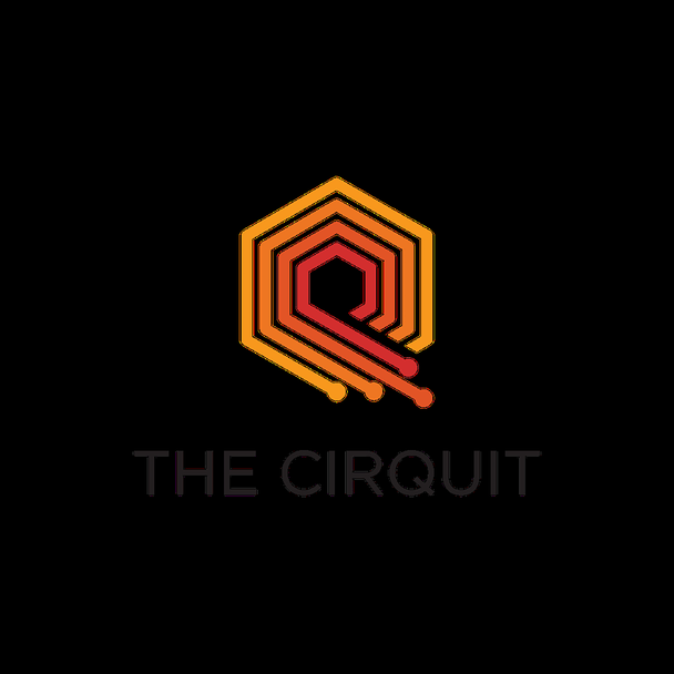
bo_rad - Logo Design
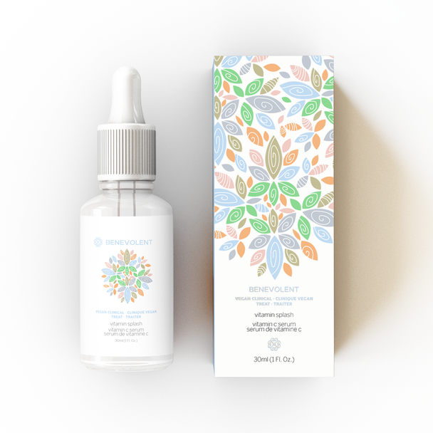
Packaging design J U L I A M A R I E
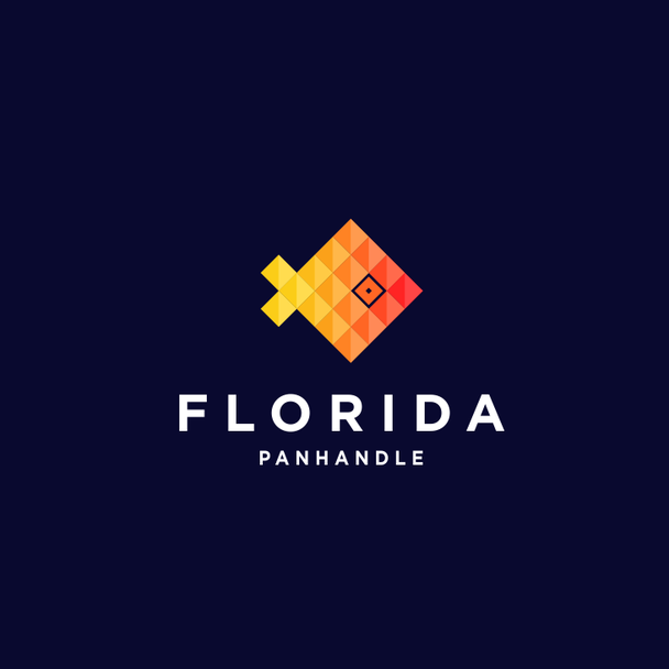
CostinLogopus Logo Design
enfanterrible - Logo Design
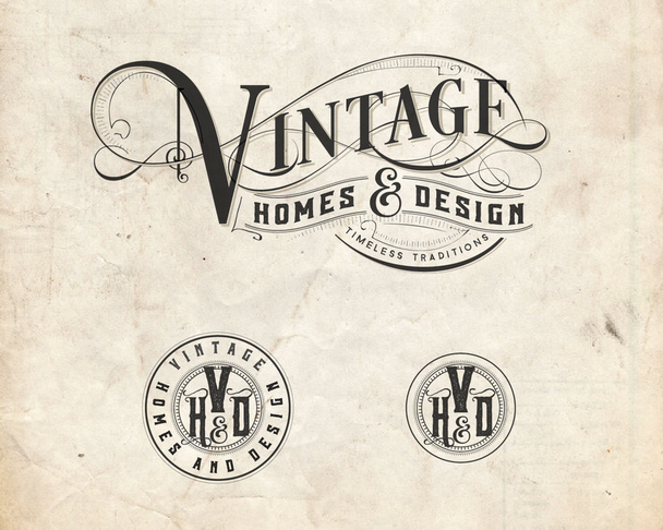
4. Vintage as inspiration
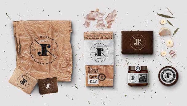
In 2019 we will see vintage mainly in logo and packing design.
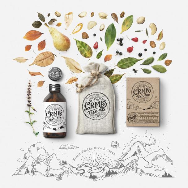
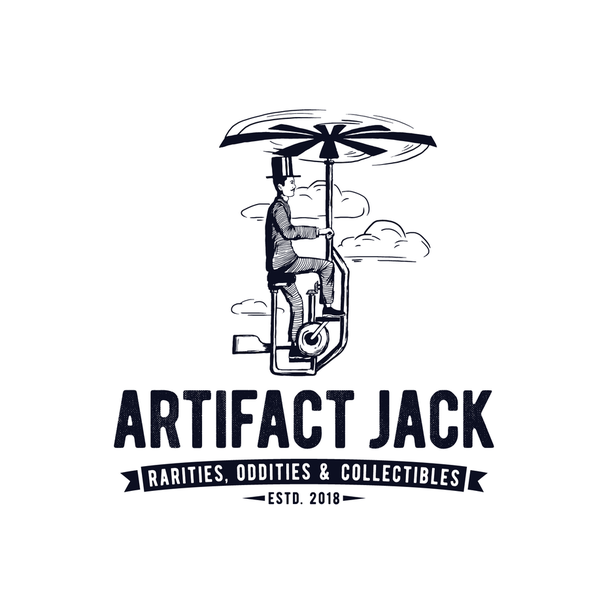
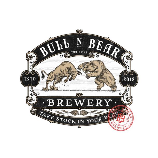
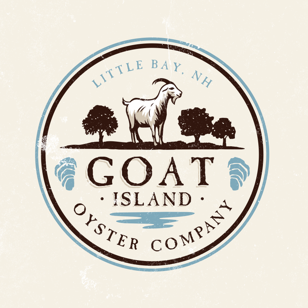
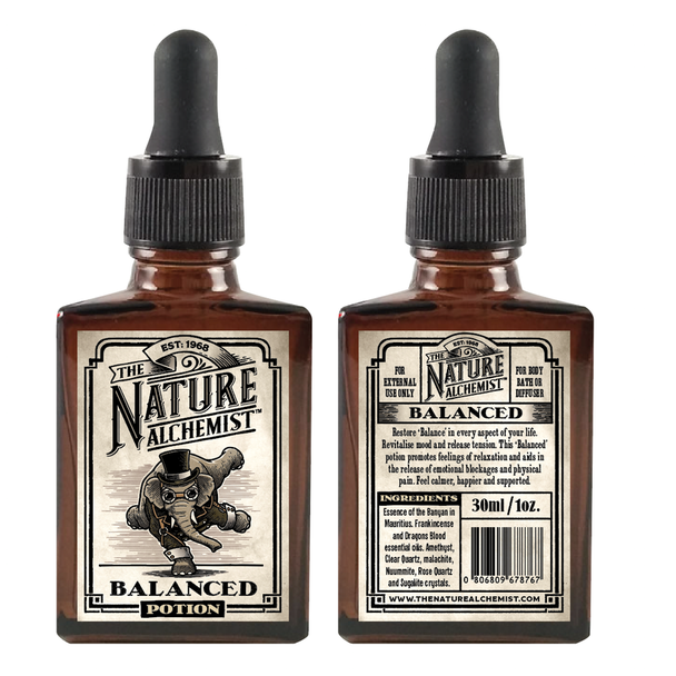
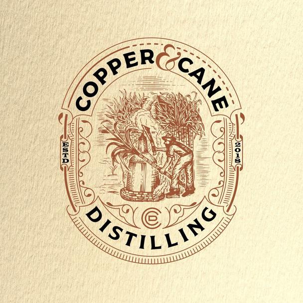
VIntage inspired logos center around the main image, most likely hand-drawn illustrations. They are often frames and includes the company’s name in a hand lettered font. If there is some more space even slogans are included. Vintage logos also include the year of establishment of the brand and usually, they look very old fashioned.
Martis Lupus -Packaging design
Footstep -Logo Design
GOOSEBUMPS -Logo Design
DSKY -Logo Design
Steve Hai- Packaging design
Sign²in- Logo Design
For my consultation and help, me and my company will be always with you.
Only original solutions - Lemons.ge
Address: Tsereteli ave. #117ა
Office: (+995) 032 2 45 01 01
