10 creative branding trends in 2019, Part 3
8. 3D imagery
Technology has a great influence on branding trends and when one company starts modern, innovational visuals, people raise their standards and start to expect the same standard in all their favorite brands.
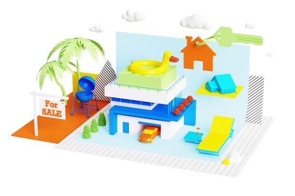
This is exactly what we see happening with 3D imagery. Designers take modern design software to its limits with impressive, photorealistic 3D imagery, blurring the lines between real life and computer-generated visuals.
At the same time, decorative details, in 3D imagery, need jaw-dropping visuals and an accurate eye for details to create a picture that will be appreciated by viewers. This trend is good not only for logos but also for websites and designs of topography. By applying it to branding, you show potential customers how clever your brand is, all without saying a word.
Katt Phatt™
Pinch Studio-
**Faith**
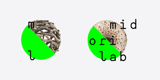
9. Proactive negative space
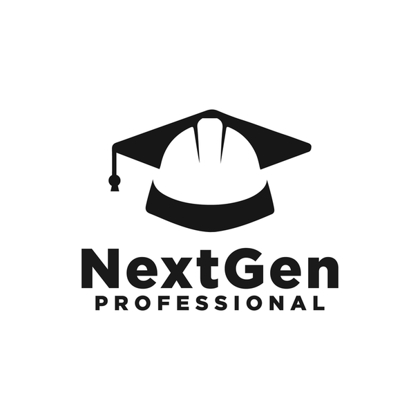
Not all the trends are rooted in technology and reflect the conditions of society. Some of them are just whatever people like at certain moments. Recently it is Negative space and more and more designers are using this trend.
What do we mean by “proactive negative space”? It is using empty space as part of a visual to communicate a hidden meaning or a clever message. Nowadays, designers have taken negative space to the next level by using it to create memorable and creative designs.
Using this trend is perfect in the case of adding duality and hidden levels to your brand. It allows you to use two images instead of one. By turning negative space into an image, you make your textual logo more visual dynamic and also guarantees that it will never be boring.
cucuque design-
Artvin
Smeg!
m∾ns™
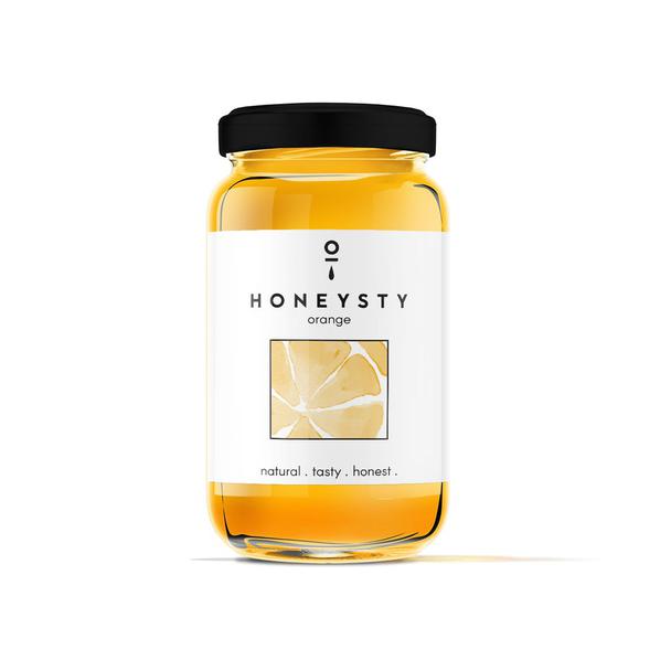
10. Neo-Minimalism
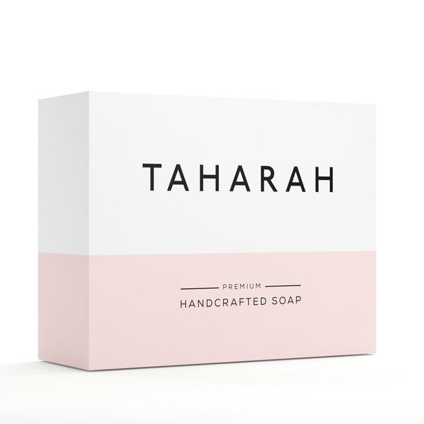
New-minimalism is sub-genre of minimalism trend and represents a new vision to modern style. It is a more exaggerated version of minimalism. Design is characterized by fewer details, more negative space, combined with flashy colors and bold typography. All of it makes it look modern.
Have you noticed websites with empty pages only with one or two words on it? This is how new-minimalism looks like. Here colors and fonts talk instead of words.
Logo designs can consist of nothing more than a couple lines and shapes, although delivering more message than other, overloaded images. Even in packing design, this trend is present with largely empty wrappers filled with bold typography and minimalistic imagery to tell more about the product.
MMX
MihaiJ
goopanic
For my consultation and help, me and my company will be always with you.
Only original solutions - Lemons.ge
Address: Tsereteli ave. #117ა
Office: (+995) 032 2 45 01 01
